How to Decide What Stays and What Goes
Most homepage problems aren’t design problems, they are governance problems.
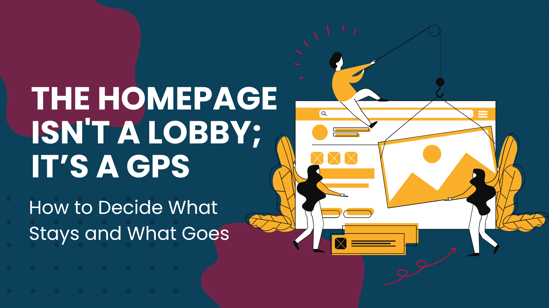
When a team can’t agree on what’s important, the homepage becomes a “junk drawer” of competing priorities. We treat it like a lobby where everyone is shouting at once, when we should treat it like a GPS: a tool that tells the user exactly where they are and how to get where they’re going.
A high-performing homepage isn’t a summary of your company; it’s an orientation layer. Its job isn’t to close the sale, it’s to earn the click to the next page.
If you are struggling to decide if a section belongs on the front page, run it through this filter. If it doesn’t get four “Yes” votes, move it to a sub-page.
- Does this help a stranger self-identify? (e.g., “I am a CTO and this is for me.”)
- Does it answer “What do you actually do?” in under 5 seconds?
- Is this a ‘Signpost’ or a ‘Destination’? (Homepages should be 80% signposts.)
- Does this reduce anxiety? (Does it prove you are legitimate and safe to hire?)
To avoid a “boring” homepage, stop using generic headers. Use functional blocks that solve the user’s immediate psychological needs.
| Section | The Solution It Provides |
|---|---|
| The Above-the-Fold Signal | Clarity. Not a “vision statement,” but a plain-English explanation of your category, your primary audience, and your unique “unlock.” |
| The “Problem Mirror” | Relevance. A brief section that reflects the user’s current pain points back to them so they feel understood. |
| The Capability Map | Navigation. A high-level visual menu of your services. Not the full details—just the “buckets” so they know where to click. |
| The Authority Bridge | Trust. Logos, a single high-impact testimonial, or a “By the Numbers” stat. It proves you’ve done this before. |
| The Singular Exit | Direction. One primary Call to Action (CTA) that stands out from everything else. |
These are the items that dilute your message and kill conversion rates. Move these to your “About,” “Services,” or “Blog” pages:
- The “Welcome” Essay: No one reads three paragraphs of introductory text. If it’s longer than two sentences, it’s a wall, not a window.
- The Full Team Bio: Unless you are a one-person celebrity brand, your team’s 15 headshots belong on the “About” page.
- Granular Features: Don’t explain how the software works or the 10-step methodology of your consulting. Explain the outcome.
- Internal News: “We just moved offices!” is great for LinkedIn, but it doesn’t help a new lead solve their problem.
In many organizations, the homepage is crowded because every department head wants their “square.” This is a recipe for a high bounce rate.
The Solution: Instead of giving everyone a section on the homepage, give them a clear path in the navigation. Explain to stakeholders that the homepage’s only goal is to distribute traffic. If the homepage is too long, users get “scroll fatigue” and never see the bottom sections anyway. A lean homepage actually sends more qualified leads to the deeper service pages because it doesn’t distract them along the way.
We don’t view the homepage as a “content container.” We view it as a decision surface. Our process involves:
- Auditing your “Primary Path”: Identifying the #1 thing you want a user to do.
- Stripping the “Justification”: Removing the need to “prove” everything on page one.
- Designing for Momentum: Creating a flow where each section answers a question and then points to the next step.
The Result: A homepage that feels calm, confident, and incredibly easy to use.
Next Step for You
Look at your current homepage. If you removed everything except the headline and the main button, would a stranger still know what you sell?
Would you like usto help you audit your current homepage copy to see which sections are actually working against you?
To round out this blog post, we need to ensure the technical SEO and user intent elements are just as sharp as the content.
Since the blog is about curating rather than dumping content, the meta-data should feel authoritative and provide a “relief” to the reader’s problem (overwhelmed websites).
Frequently Asked Questions
Share This Story, Choose Your Platform!
How to Decide What Stays and What Goes
Most homepage problems aren’t design problems, they are governance problems.
When a team can’t agree on what’s important, the homepage becomes a “junk drawer” of competing priorities. We treat it like a lobby where everyone is shouting at once, when we should treat it like a GPS: a tool that tells the user exactly where they are and how to get where they’re going.
A high-performing homepage isn’t a summary of your company; it’s an orientation layer. Its job isn’t to close the sale, it’s to earn the click to the next page.
If you are struggling to decide if a section belongs on the front page, run it through this filter. If it doesn’t get four “Yes” votes, move it to a sub-page.
- Does this help a stranger self-identify? (e.g., “I am a CTO and this is for me.”)
- Does it answer “What do you actually do?” in under 5 seconds?
- Is this a ‘Signpost’ or a ‘Destination’? (Homepages should be 80% signposts.)
- Does this reduce anxiety? (Does it prove you are legitimate and safe to hire?)
To avoid a “boring” homepage, stop using generic headers. Use functional blocks that solve the user’s immediate psychological needs.
| Section | The Solution It Provides |
|---|---|
| The Above-the-Fold Signal | Clarity. Not a “vision statement,” but a plain-English explanation of your category, your primary audience, and your unique “unlock.” |
| The “Problem Mirror” | Relevance. A brief section that reflects the user’s current pain points back to them so they feel understood. |
| The Capability Map | Navigation. A high-level visual menu of your services. Not the full details—just the “buckets” so they know where to click. |
| The Authority Bridge | Trust. Logos, a single high-impact testimonial, or a “By the Numbers” stat. It proves you’ve done this before. |
| The Singular Exit | Direction. One primary Call to Action (CTA) that stands out from everything else. |
These are the items that dilute your message and kill conversion rates. Move these to your “About,” “Services,” or “Blog” pages:
- The “Welcome” Essay: No one reads three paragraphs of introductory text. If it’s longer than two sentences, it’s a wall, not a window.
- The Full Team Bio: Unless you are a one-person celebrity brand, your team’s 15 headshots belong on the “About” page.
- Granular Features: Don’t explain how the software works or the 10-step methodology of your consulting. Explain the outcome.
- Internal News: “We just moved offices!” is great for LinkedIn, but it doesn’t help a new lead solve their problem.
In many organizations, the homepage is crowded because every department head wants their “square.” This is a recipe for a high bounce rate.
The Solution: Instead of giving everyone a section on the homepage, give them a clear path in the navigation. Explain to stakeholders that the homepage’s only goal is to distribute traffic. If the homepage is too long, users get “scroll fatigue” and never see the bottom sections anyway. A lean homepage actually sends more qualified leads to the deeper service pages because it doesn’t distract them along the way.
We don’t view the homepage as a “content container.” We view it as a decision surface. Our process involves:
- Auditing your “Primary Path”: Identifying the #1 thing you want a user to do.
- Stripping the “Justification”: Removing the need to “prove” everything on page one.
- Designing for Momentum: Creating a flow where each section answers a question and then points to the next step.
The Result: A homepage that feels calm, confident, and incredibly easy to use.
Next Step for You
Look at your current homepage. If you removed everything except the headline and the main button, would a stranger still know what you sell?
Would you like usto help you audit your current homepage copy to see which sections are actually working against you?
To round out this blog post, we need to ensure the technical SEO and user intent elements are just as sharp as the content.
Since the blog is about curating rather than dumping content, the meta-data should feel authoritative and provide a “relief” to the reader’s problem (overwhelmed websites).